Key takeaways
- Focus on immediate value propositions
- Remove unnecessary friction points
- Trust is built through visible social proof
- Clarity beats creativity in headlines
Before and After
Why it worked:
Open the leaderboard
Landing page examples SaaS blueprints
Most SaaS landing pages fail because they confuse the visitor with vague jargon. Who this is for: B2B founders and marketers scaling their outreach processes. We analyzed a 25 percent conversion lift on the Flow page to understand exactly what captures user attention.
This is where conversion breaks: when your headline fails to match the user mental model immediately. The page redesign replaced generic copy with direct outcome-based language, simplifying the user journey from landing to action.
By using LandingBoost, the team shifted from abstract benefits to concrete product previews. This change made the value proposition feel real and immediate, proving that a transparent UI leads to faster signups.
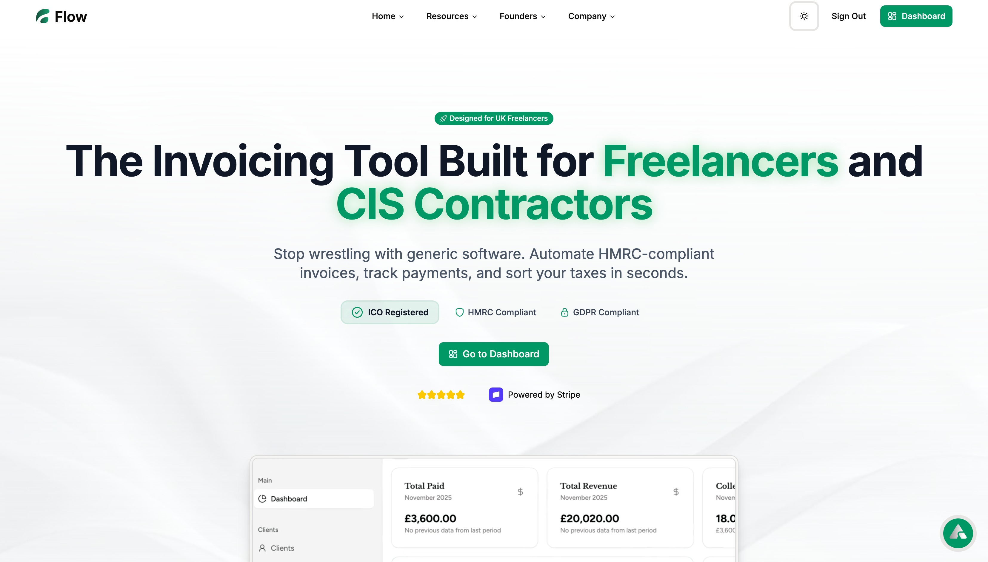
Before state
The original layout forced users to scroll past excessive text just to understand the baseline functionality. Visitors saw a lack of contrast on call-to-action buttons and ambiguous subheadlines that hid the actual utility of the tool.
Action step: Audit your current page to see if a first-time visitor can identify your primary offering in under three seconds.
Copy example
Before: Unlock your potential with our advanced digital automation suite.
After: Automate your workflow and save 10 hours a week on manual tasks.
Why people moved: Users felt an intuitive shift when the focus moved from generic corporate empowerment to a specific, quantified productivity gain.
Scan your page
See real landing page examples
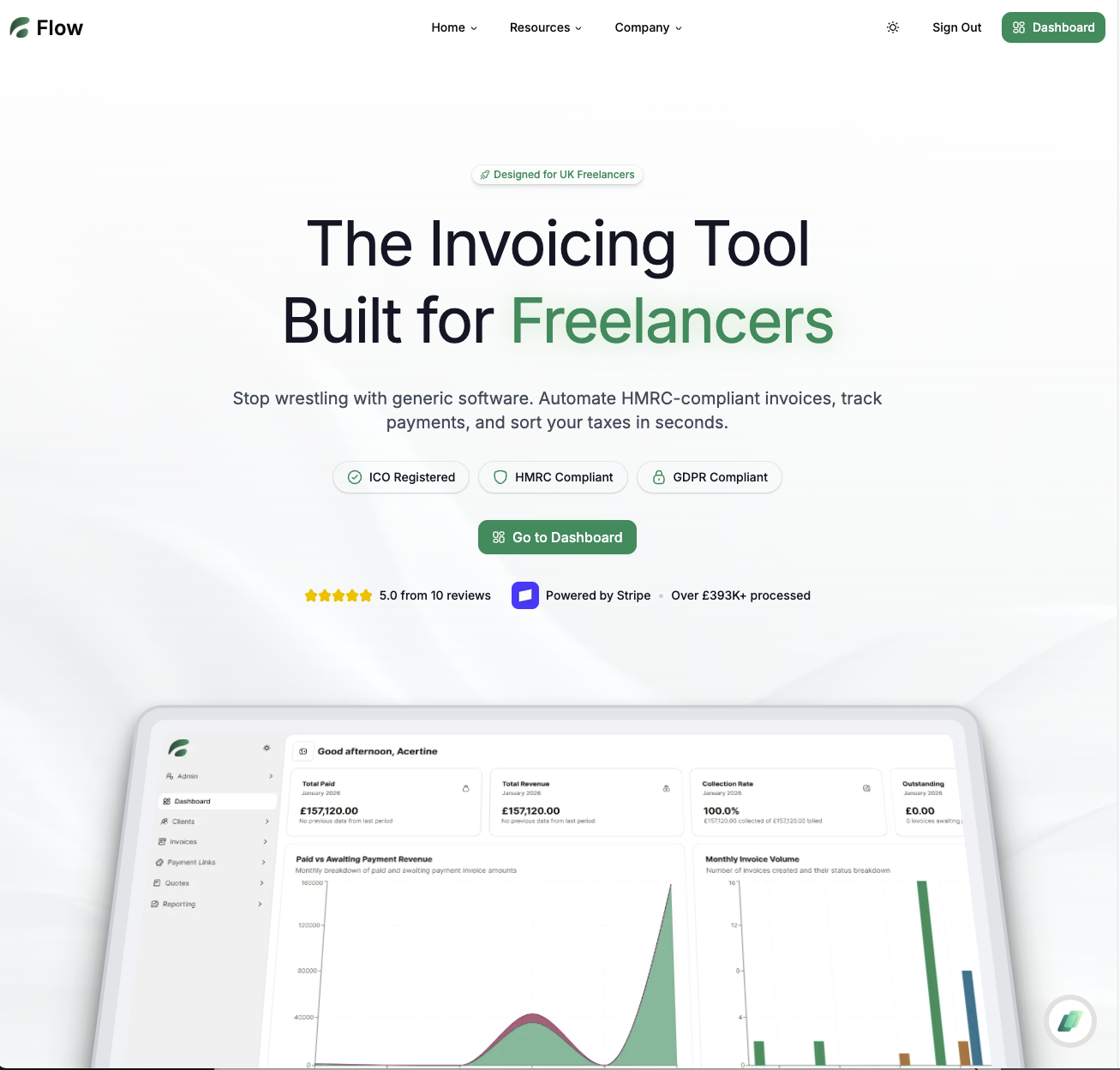
After state
The redesigned Flow landing page prioritizes a clear product preview above the fold. By centralizing the core workflow visual, the site reduced the cognitive load for new users, making the path to conversion feel effortless.
Action step: Place a high-fidelity image or interactive element showing your dashboard immediately next to your headline.
Copy example
Before: Our platform integrates easily with all your favorite tools.
After: Connect your existing tech stack in 60 seconds with one-click integrations.
- Headline highlights the specific user benefit
- Navigation bar reduced to essential links only
- CTA button color increased contrast against background
- Removed secondary distractions in the footer
Conversion anatomy
We saw that friction removal was key, specifically by cutting unnecessary form fields and tightening the page top-to-bottom. The page used proof shown through verified customer logos and live usage statistics to drive trust.
Action step: Remove every field in your sign-up form that is not strictly required for the initial interaction.
Copy example
Before: Fill out this form to request a demo call with sales.
After: Start your free trial instantly—no credit card required.
Leaderboard proof
Real landing page examples illustrate that high-performing pages prioritize visual hierarchy over text density. By analyzing top-performing SaaS assets, it becomes clear that users prefer to see, not read, the solution to their specific problem.
Action step: Create a visual checklist of your site’s most important elements to ensure the most valuable links appear first.
- Clear hero image showing product interface
- Social proof badges from notable clients
- Concise benefit-oriented bullet points
- Short form with low barrier to entry
FAQ
Q: Does design matter more than copy?
A: Both work together to provide clarity, but design acts as the primary gatekeeper for user attention.
Q: How do I identify friction points?
A: Analyze where users drop off in your scroll map; those areas usually contain unnecessary distractions.
Q: Is a 25 percent conversion rate realistic?
A: It is achievable when you rigorously prune your copy and match your landing page to specific user intent.
Built with Lovable
I built this blog system and LandingBoost using Lovable to ship fast.
Ultimately, a successful landing page is a balance of trust and clarity. By streamlining the user flow, the Flow page achieved a 25 percent conversion rate, proving that simplicity is the most effective conversion strategy available to modern SaaS teams.