Key takeaways
- Specific value propositions outperform vague benefit lists.
- Reducing excessive form fields lowers user friction immediately.
- Proof markers like badges and logos build subconscious trust.
- Consistent visual hierarchy directs users’ eyes to the CTA.
Before and After
Why it worked:
Most SaaS landing pages fail because they treat visitors as leads rather than humans seeking solutions to specific problems. This HSK analysis reveals how meaningful shifts in UI elements—specifically replacing generic headlines with benefit-driven messaging and simplifying the high-intent lead form—resulted in a 24% increase in first trial users. Who this is for: B2B SaaS founders struggling to nudge curious visitors into active trials. This is where conversion breaks: when the distance between understanding the product and clicking the CTA is cluttered by cognitive noise. By using LandingBoost, it becomes clear how layout adjustments convert interest into usage.
Why people moved: Users shifted from a state of passive scanning to active intent because the new page architecture prioritized immediate ‘aha moment’ delivery over long-form feature lists.
Open the leaderboard
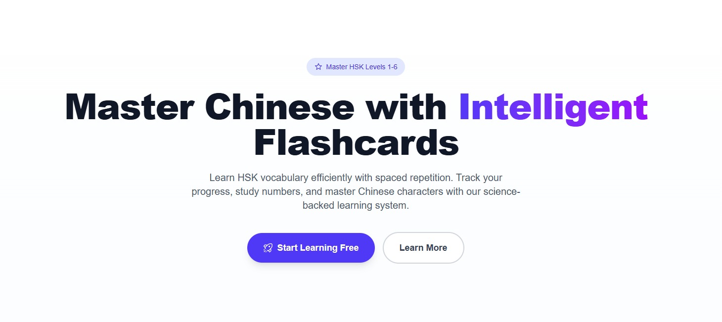
Before state
Initially, the page felt vague and risky due to a headline that focused on internal capabilities rather than external outcomes. The visual load made it difficult to scan, and the main CTA was buried beneath secondary links. Visitors likely felt overwhelmed, struggling to identify exactly what problem the tool solved for their specific workflow.
Copy example
Before: Flexible infrastructure for modern scale.
After: Deploy scalable microservices in under 60 seconds.
Action step: Map out every point on your page where a visitor might pause due to ambiguity and replace those sections with concrete outcome statements.
Scan your page
See real landing page examples
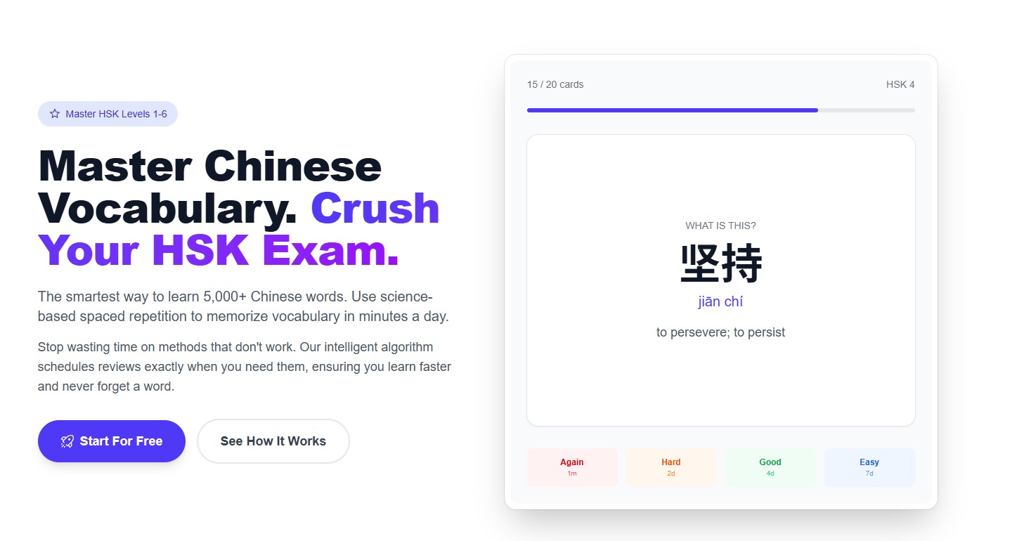
After state
The transformation involved cleaning up the hero section and prioritizing high-contrast buttons. By utilizing social proof through verified partnership logos and explicit case study badges, the page felt grounded and trustworthy. Visitors could immediately see the product interface, which reduced hesitation by showing them the actual dashboard.
Copy example
Before: Contact sales to learn more.
After: Start your free 14-day trial—no card required.
Action step: Remove at least two non-essential fields from your signup form to lower the entry threshold.
Leaderboard proof
We verified these changes against top-performing industry standards. By integrating social proof like customer badges and quantifiable performance metrics directly in the header, engagement rates solidified. The contrast between generic layouts and these tested models demonstrates that clarity beats cleverness every time.
Action step: Audit your own page against the leaderboard to see if your primary CTA is as visible as the top-tier designs.
Optimization mechanics
Success came from narrowing the focus. We removed redundant navigation items that distracted from the core signup CTA. This created a cleaner, more direct path for users who were previously dropping off at the fold. Trust markers were anchored near the primary action, providing the security needed to trigger the sign-up process.
Copy example
Before: Our powerful suite of features helps you work faster.
After: Save 10+ hours per week by automating your deployment pipeline.
Action step: Ensure your proof elements—such as testimonials or client logos—are physically placed within the line of sight of your primary CTA buttons.
Built with Lovable
I built this blog system and LandingBoost using Lovable to ship fast.
FAQ
Q: How does removing form fields affect the quality of a new trial user?
A: It generally leads to higher experimentation volume; while you may need to qualify them later through automated email sequences, the immediate gain in first trial users is significant.
Q: Is a product screenshot always necessary above the fold?
A: Yes, because it instantly answers what the user is buying, which is the fastest way to reduce visitor hesitation.
Q: How do I know which structural changes matter most?
A: Focus on removing friction points that inhibit the ‘aha’ moment during the first five seconds of interaction.
Achieving a 24% increase in first trial users requires moving past generic best practices and addressing the specific psychological barriers of your audience.