Key takeaways
- Focus on clear value propositions above the fold
- Align messaging with specific user personas
- Simplify navigation to reduce bounce rates
- Use social proof to build immediate authority
Before and After
Why it worked:
Startups often struggle with clarity, and this is where conversion breaks for most SaaS brands. Who this is for: founders and marketing teams looking to improve their conversion rate by 15% through design precision. By updating the hero headline and implementing a cleaner Flow for the main call-to-action, the site saw a massive shift in engagement. Using LandingBoost architecture, we streamlined the visual hierarchy to prioritize user needs.
Why people moved: Users transitioned from confusion to confidence because the new layout clearly mapped their pain points to the specific solution provided.
Open the leaderboard
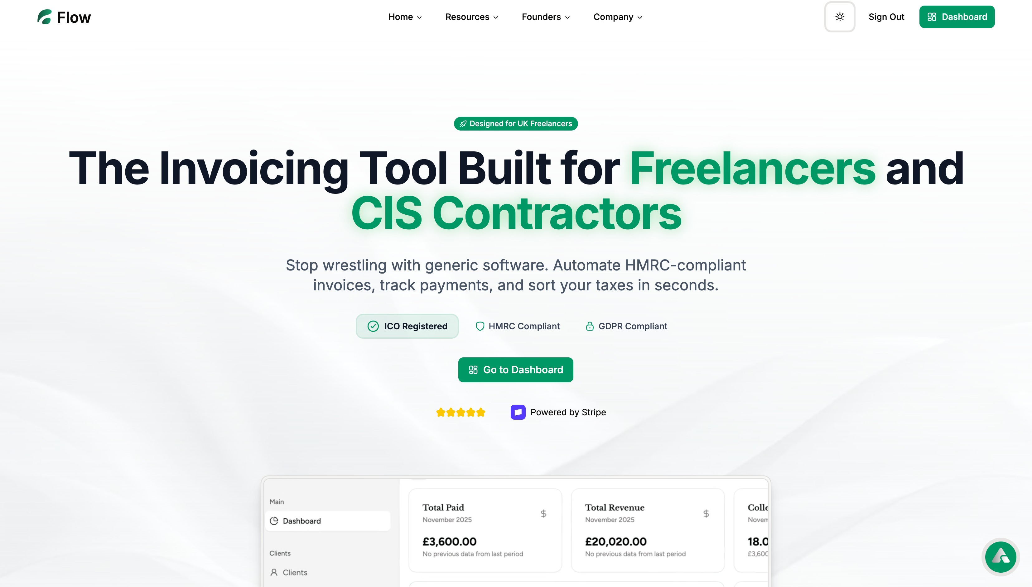
Before state
Visitors were initially met with a cluttered headline and non-descriptive subheaders that failed to define the product utility. The page lacked visual flow, causing users to scroll past essential information without clicking.
Action step: Audit your hero section for ambiguity by asking a stranger if they understand your product in five seconds.
Copy example
Before: Unlock your potential with our platform.
After: Automate your customer onboarding sequence in minutes.
Scan your page
See real landing page examples
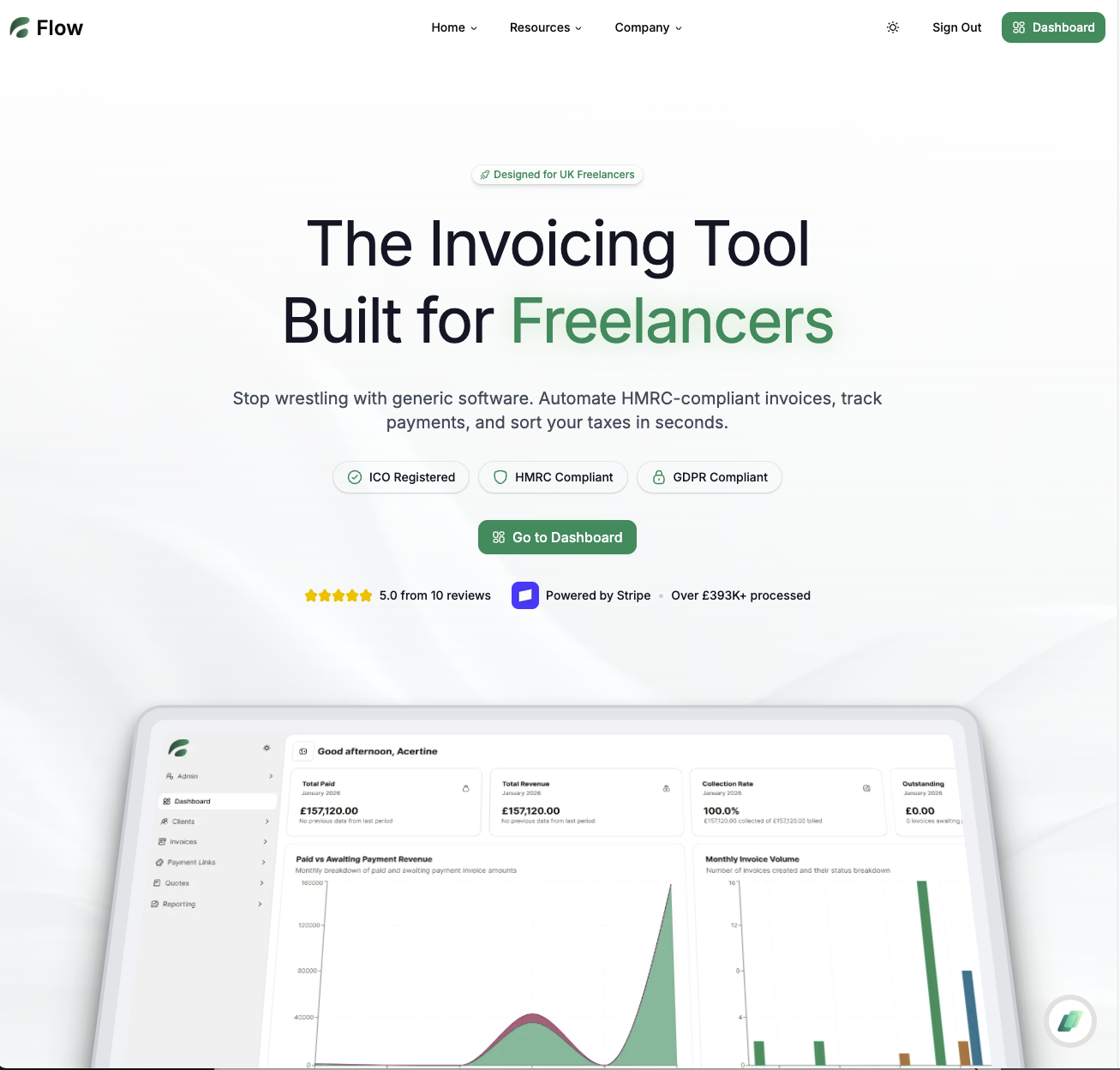
After state
The refined version utilized high-contrast buttons and a simplified navigation bar that kept the focus on the primary sign-up path. By removing extraneous links, we directed traffic toward the feature set that drives the most interest.
Action step: Remove every nav item that doesn’t lead directly to a high-value conversion action.
Copy example
Before: Click here for more info.
After: Start your 14-day free trial now.
Leaderboard proof
The changes centered on removing friction by simplifying the sign-up fields and adding verified review badges. We showcased trust by highlighting specific integration logos and user testimonial stats that were previously buried. These additions provided the necessary proof shown to nudge hesitant leads toward the final checkout process.
Action step: Ensure your social proof elements have high visibility near every CTA.
Copy example
Before: Join thousands of customers.
After: Trusted by 500+ teams like yours to scale operational workflows.
FAQ
Q: How do I identify if my landing page needs changing?
A: If your bounce rate exceeds 70%, your messaging likely lacks alignment with your audience’s intent.
Q: Does design matter more than copy?
A: They are inextricably linked; your design directs the eyes, while your copy closes the sale.
Built with Lovable
I built this blog system and LandingBoost using Lovable to ship fast.
By applying these strategic adjustments, the site successfully achieved a 15% increase in conversion rate.