Key takeaways
- Adding a clear explanation under the headline eliminates initial confusion.
- Showing product UI above the fold bridges the gap between vision and reality.
- Introducing social proof signals legitimacy to skeptical users.
- Increasing CTA visibility removes friction from the conversion process.
- Aligning content with user intent is critical for high-performing SaaS pages.
Before and After
Why it worked: Adding clarity and proof transformed perception instantly
Open the leaderboard
- Before state diagnostics
- After state improvements
- Design impact analysis
- Leaderboard proof
- Common SaaS landing page questions
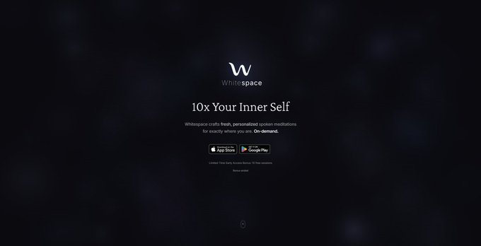
Before state
Initially, this page for the Whitespace app failed to communicate value instantly. Visitors landed on the page and saw a lack of trust and minimal information, which left them wondering what the product actually did. This is where conversion breaks because visitors ignore what they cannot understand within seconds. Action step: Audit your own page to see if a stranger can explain your core value in under five seconds.
Copy example
Before: Generic headline without supporting subtext.
After: Descriptive headline with a secondary line explaining the workflow.
Why people moved: By providing a concrete explanation, the user felt a shift from uncertainty to confidence, which validated their reason for clicking the ad.
Scan your page
See real landing page examples
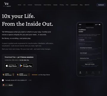
After state
The redesign transformed user perception by making the product’s function visible immediately. We added a clear explanation under the headline, presented the UI above the fold, and added social proof to build credibility. These changes removed unclear value and lack of trust that previously paralyzed visitors. LandingBoost recommends this iterative approach to ensure every element serves a specific purpose. Action step: Ensure your hero section contains a clear value statement coupled with a high-fidelity image of your actual application interface.
Copy example
Before: No social proof or user validation metrics available.
After: Included app store presence badges and prominent trust indicators.
Design impact analysis
The visual changes had a direct effect on user behavior for those exploring self improvement apps. By showing product UI above the fold, we reduced the cognitive load required to understand the software, while the new social proof provided the necessary comfort for final decision-making. Action step: Review your visual hierarchy to confirm the primary CTA is the most prominent element on your screen.
- Headline clarity checklist: Is the primary problem addressed?
- Social proof checklist: Are there ratings or logos present?
- Navigation checklist: Are there unnecessary distractions to be removed?
Leaderboard proof
Our audit of landing page examples SaaS developers use shows that the gap between a 35 and 75 score often comes down to these specific trust-building tactics. Showing an app store presence proved vital here, signaling that the product exists outside of just a website. Action step: Integrate real app store or review platform badges consistently across your landing page layout.
Copy example
Before: Hidden product value and unclear call to action.
After: High-visibility button paired with immediate context of the product’s UI.
Built with Lovable
I built this blog system and LandingBoost using Lovable to ship fast.
FAQ
Q: Why is my SaaS landing page failing to convert?
A: Usually, because your value proposition isn’t clear within the first view or lacks concrete proofs like UI screenshots.
Q: How does UI visibility help conversions?
A: It reduces uncertainty, as users want to visualize the tool they are about to invest time or money into.
Q: What is the biggest mistake in SaaS landing pages?
A: Over-complicating the hero section or forgetting that users need to see proof early in the journey.
In conclusion, transforming the Whitespace page allowed us to move the score 35 to 75 by focusing on immediate clarity and visible product proof.