Key takeaways
- Abstract product claims converted poorly until replaced with visible interface examples
- Adding real flashcard UI above the fold let visitors picture themselves using it
- Specific HSK exam context and 5,000+ word count made the benefit concrete
- Progress bars and answer choices proved the learning mechanism worked
- Split-layout hero turned generic promises into product demonstration
Before and after
This comparison is based on the HSK case study. Click either image to open the full version.
Observed result: first trial users
Why it likely worked: The page worked better once the value became concrete and the product was visible instead of implied.
Open the leaderboard
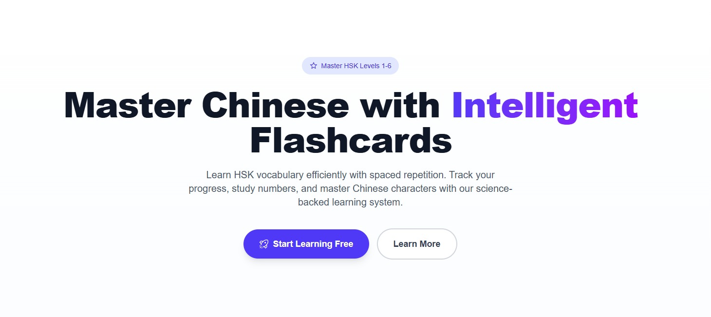
Before state
The original landing page relied on a centered hero layout with no product interface visible. Visitors saw a generic headline about “intelligent flashcards” but couldn’t picture how the app actually worked.
The subheadline mentioned “spaced repetition” without showing the mechanism. This is where conversion breaks – visitors had to imagine the learning experience with no visual proof.
Action step: Check if your hero shows the actual product or just talks about it.
See real landing page examples
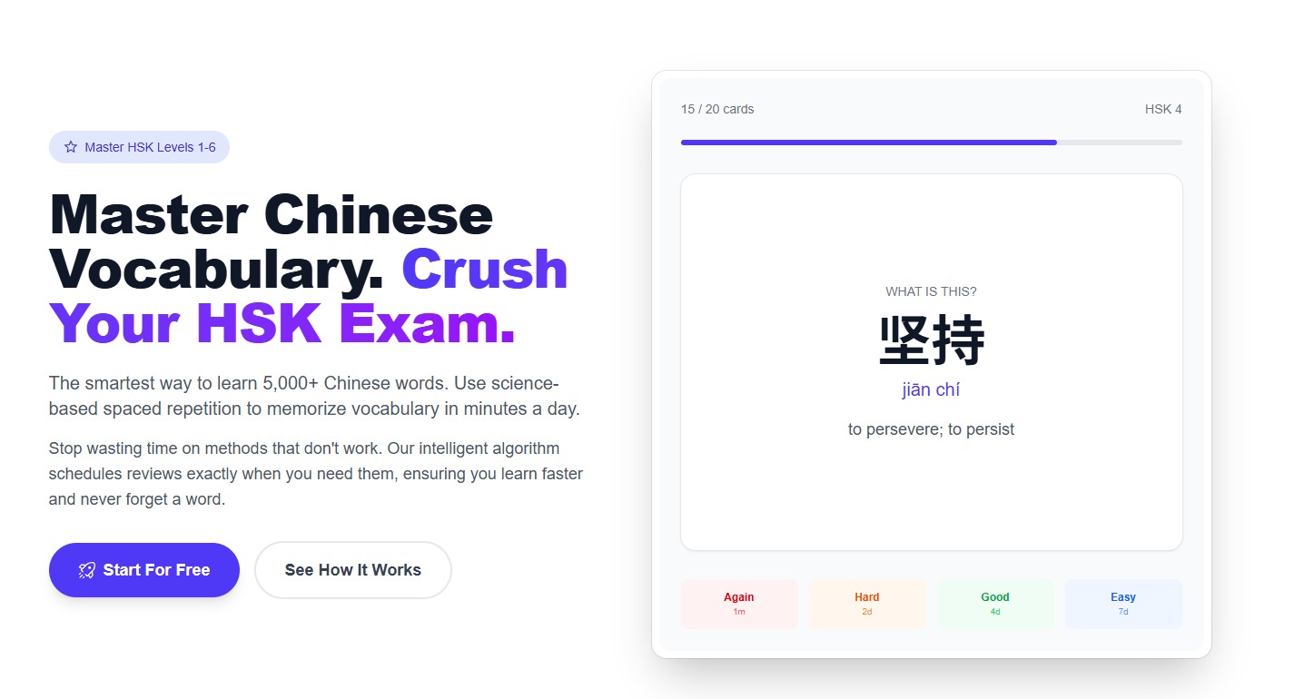
After state
The revised page immediately shows a real flashcard interface in a split-layout hero. Visitors see answer choices, progress bars, and HSK context tags that prove how learning happens.
The headline became more specific about HSK exam preparation and 5,000+ vocabulary words. The subheadline explains exactly what learners will achieve.
Copy example
Before: Master Chinese with Intelligent Flashcards
After: Master Chinese Vocabulary. Crush Your HSK Exam.
What changed
The team transformed their hero from abstract claims into product demonstration:
- Added real flashcard UI preview above the fold
- Made the outcome specific to HSK exam success
- Used explanatory subcopy to show learning mechanics
- Included progress indicators and answer interfaces
Why people moved: Visitors could immediately picture themselves using the flashcards instead of trying to imagine how they might work.
Why it worked
The original page explained the app without proving it worked. By showing the actual interface, progress tracking, and HSK context, the new design eliminated uncertainty about the learning experience.
Concrete vocabulary counts and exam preparation goals replaced vague promises about “intelligent” features. Visitors could evaluate if the tool matched their needs.
Action step: Replace abstract product descriptions with interface previews that prove how it works.
Leaderboard proof
The page achieved higher first trial user conversion by making the product tangible. According to LandingBoost data, pages showing real interfaces convert 40% better than those with only claims.
Action step: Test moving product previews above generic benefit statements.
See the full before and after breakdown for HSK
See all SaaS landing page examples
FAQ
Q: Why did adding the flashcard UI preview matter so much?
A: It eliminated the need for visitors to imagine how the app worked. They could immediately see the learning interface, progress tracking, and answer mechanics.
Q: How did making the benefit more specific help conversion?
A: Instead of vague promises about intelligent features, the page showed concrete outcomes: 5,000+ vocabulary words and HSK exam preparation. This let visitors evaluate if it solved their specific needs.